1. Auto Layout (Figma) vs Layout (Webflow)
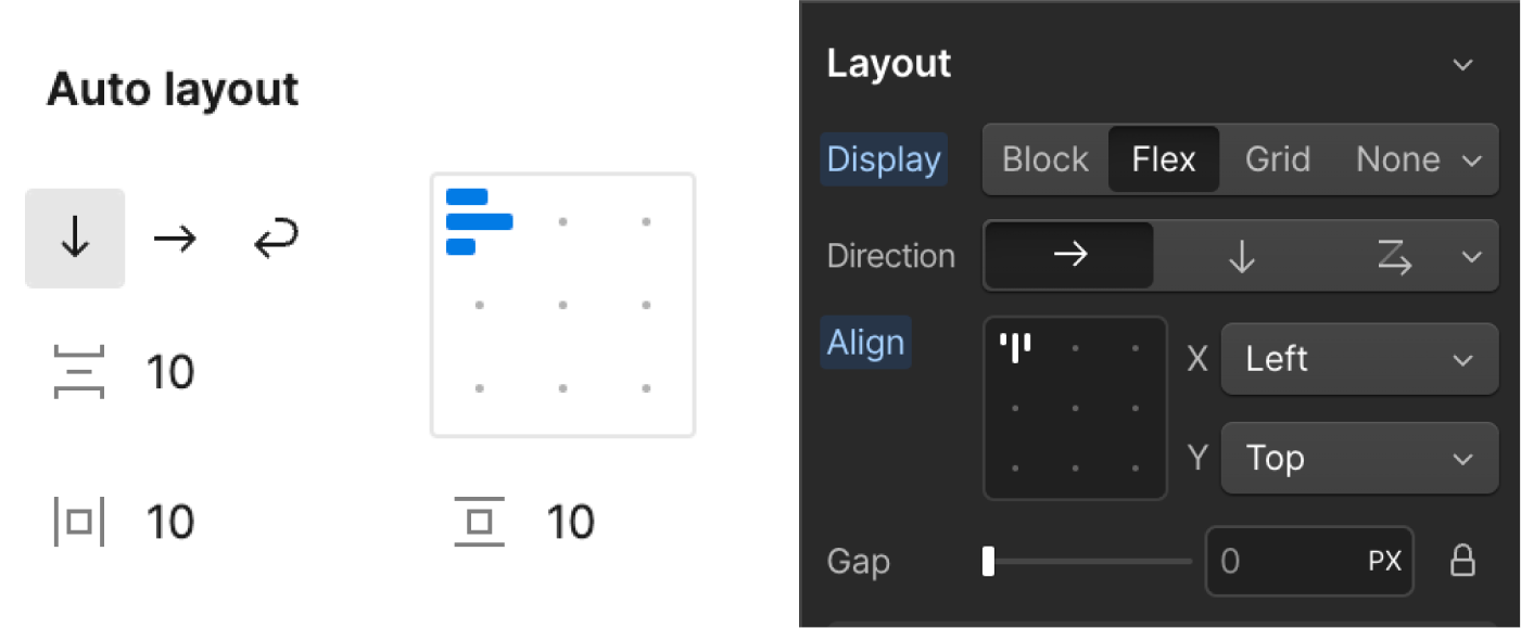
Starting with Figma's auto layout, it covers vertical & horizontal layout, layout wrap, horizontal & vertical gap. Similarly, Webflow has these features in flexbox layout. You can choose other layout in the display group in Webflow, but for the sake of this post we are going to focus on flex layout.
Like Figma's auto layout, Webflow flex also has horizontal and vertical directions. Once you choose either of these, you can further specify the alignment, the gaps etc.
2. Advanced Auto Layout (Figma) vs. Position (Weblow)
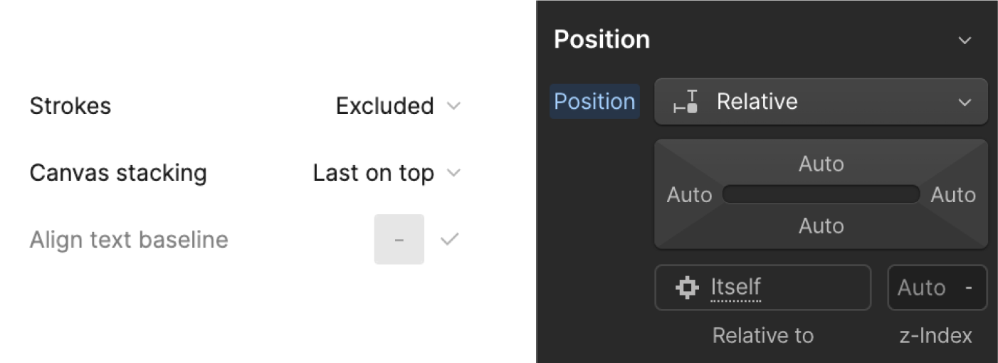
Continuing from the previous point, under Figma layout, there’s an advanced setting which is similar to the “position” feature in Webflow.
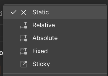
When talking about positioning in HTML, or in this case Webflow, it consist of 5 different position options: static, relative, absolute, sticky, & fixed. Static position is the default feature that have similar properties as Figma’s horizontal auto-layout frame. Element that have relative positioning, means that its position is relative to its normal position, which means you can use offsets (x & y axis) to move it without changing the layout of other elements. In addition, you can change the z-index of relative element. Z-index define the stack arrangement between the element and its siblings.
In Webflow, the default arrangement for child elements within a parent element follows the "first on top" order. You can control the stacking order of sibling elements by using the z-index property.Different from Figma, you can only either choose the arrangement for child elements between “last on top” & “first on top”. There’s no way of changing it manually using this feature, except for physically moving the frame/element itself in Figma.
3. Fixed & Sticky Positioning
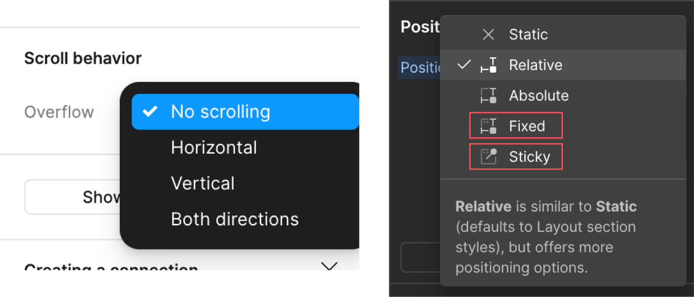
Talking about positioning, it has been sometime that Figma has added functionality for fixed and sticky positioning, which can be particularly useful for designing interactive prototypes that simulate web behaviour more accurately. To use this feature, click on the element that you wanted to make fixed or sticky, then go to “Prototype” tab on the right panel and locate the position dropdown.
In Webflow, you can easily find this in the "position" group in the Style panel. The available options include not only fixed and sticky, but also static, relative (as discussed in point no. 2), and absolute.
4. Width & Height, Min Max Value
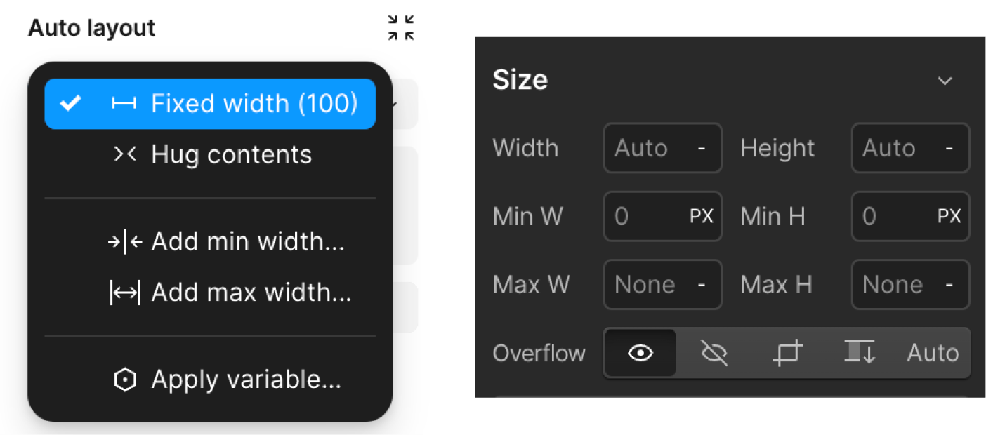
In Figma, you can set minimum or maximum width and height to any auto layout frame and its children. In addition, you will have access for fixed, fill and hug properties to its frame and direct child.

As for Webflow, setting a minimum and maximum value are more straightforward. You can find it in the size group on the right panel. Similar setting as fixed, hug, and fill properties can be found on flex child, where the options are shrink, grow, and neither.
5. Components

Creating and using components in both Webflow and Figma is a powerful way to maintain consistency and efficiency across your designs. To do this in Figma, click on the design element or group of elements you want to turn into a component. Look at the top centre bar where you will see a diamond-shaped icon. The selected design will turn purple, indicating it has become a component, easy as that.
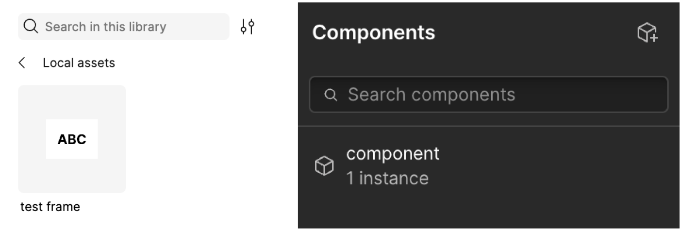
Similarly, in Webflow, click on the element or group of elements you want to turn into a component (formerly known as a symbol). Right click and choose the “create component” option. Once it turns green, this indicates that the element have becomes a component.
Once either of these are completed, you can now easily drag instances of this component from the Assets/Components panel.
Extra
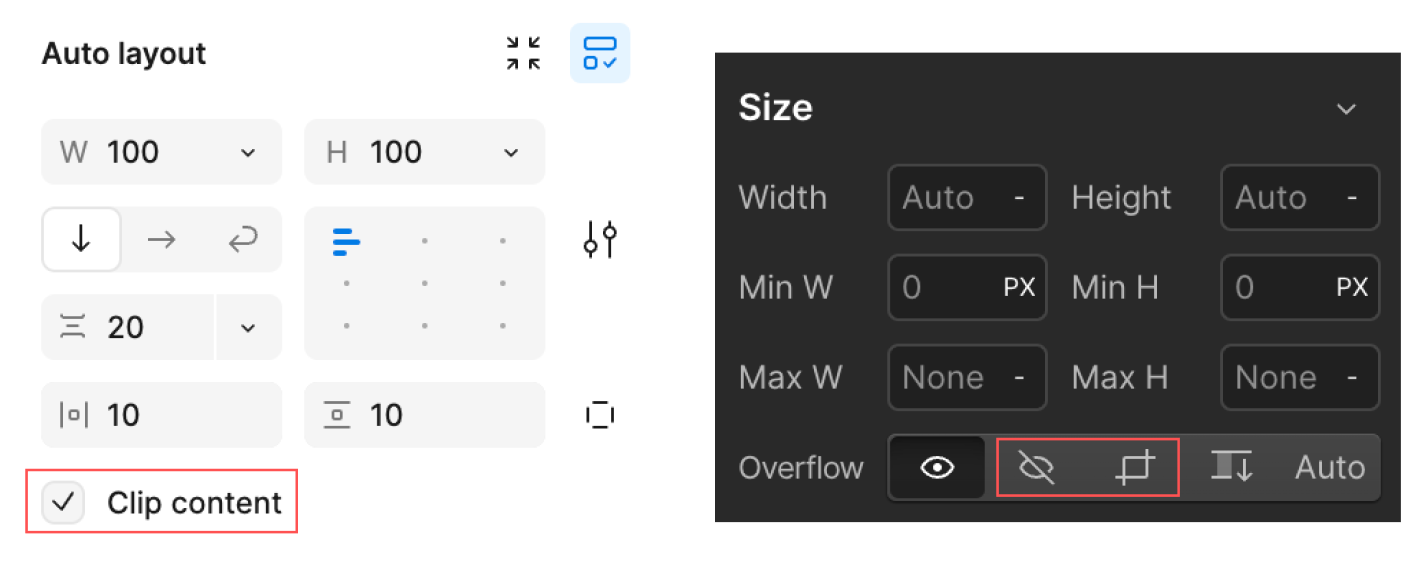
"Clip content" or "overflow hidden" determines whether elements that extend outside the bounds of the frame or block are cropped/hidden.
To access this in Figma, select the object or group of objects you want to clip, and then go to the "Layer" menu and choose "Clip Content.
"For Webflow, after clicking on the desired element, go to the Style panel, and look for the size group. There, you will see the word "Overflow" and can choose either "No Overflow" or the "Clip" icon.
.svg)
.png)


.jpg)


.png)


.jpeg)


